
All-in-one solution to get online reviews for thousands of businesses.
B2B SaaS
Web App
ROLE
Lead UI/UX Designer (Solo Contract)
TIMELINE
1.5 months
RESPONSIBILITIES
Product Design, Sitemap, Design Systems, Prototyping
TOOLS
Figma, Miro, Slack, Adobe Illustrator
Problem
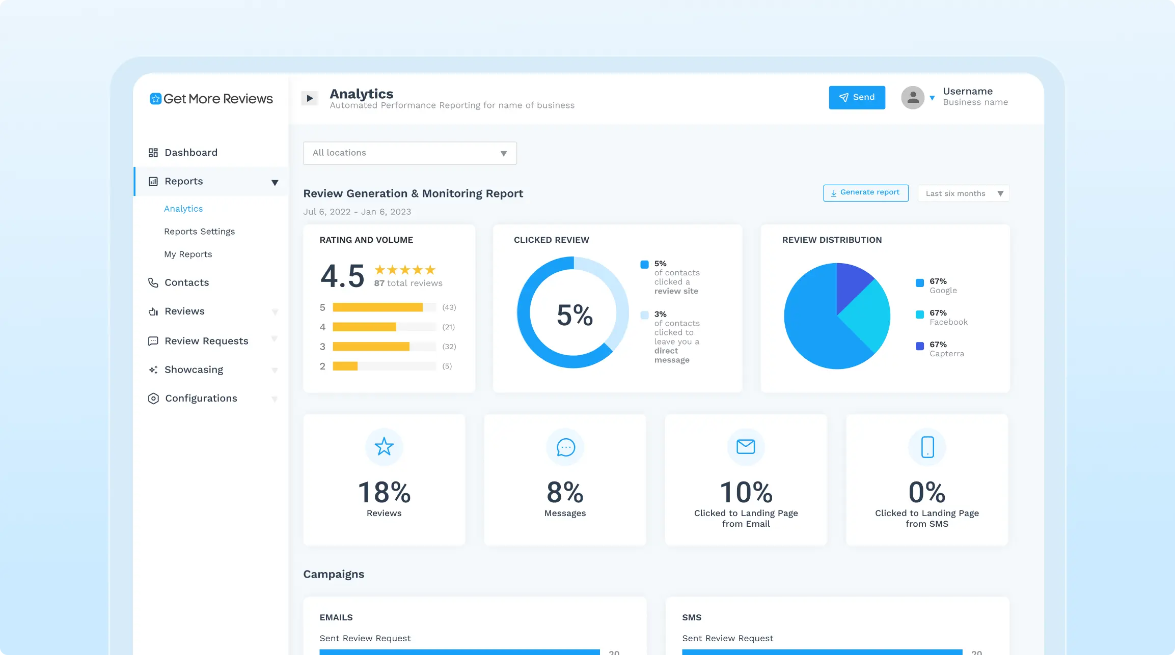
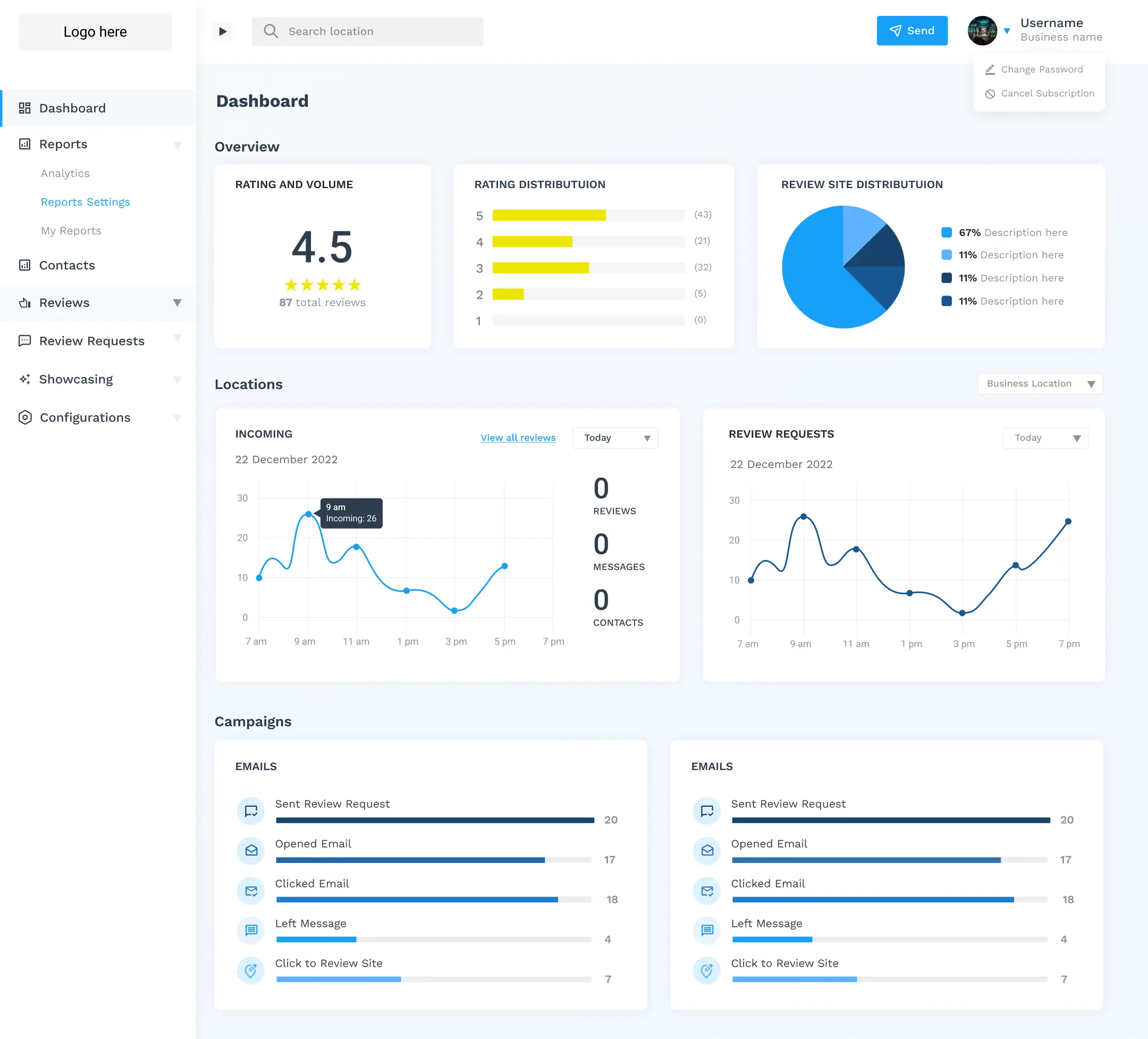
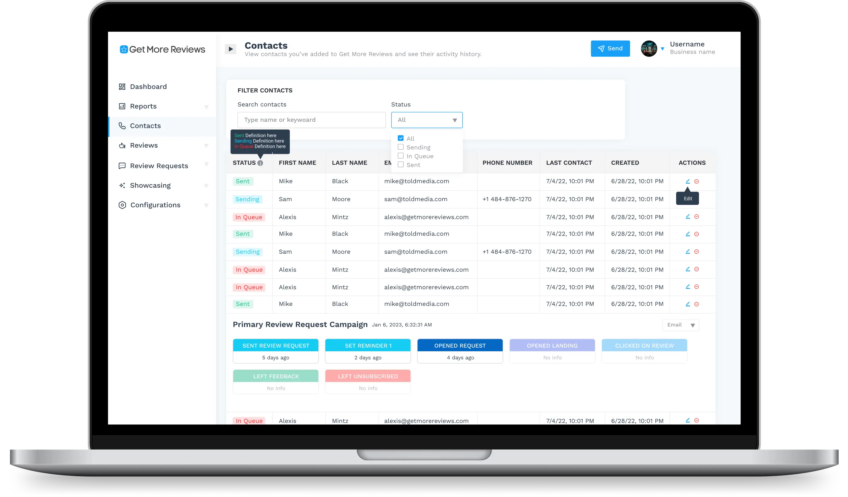
Before the overhaul of the Get More Reviews dashboard, our client faced issues with customer retention after the trial period due to the old design being difficult to navigate and understand. Additionally, the design was outdated, had excessive blank spaces, and lacked good contrast in some areas.
Solution
After reviewing the project brief from the client and interviewing them to understand the product, current problems and their design goal, our team was able to come up with the following solutions:
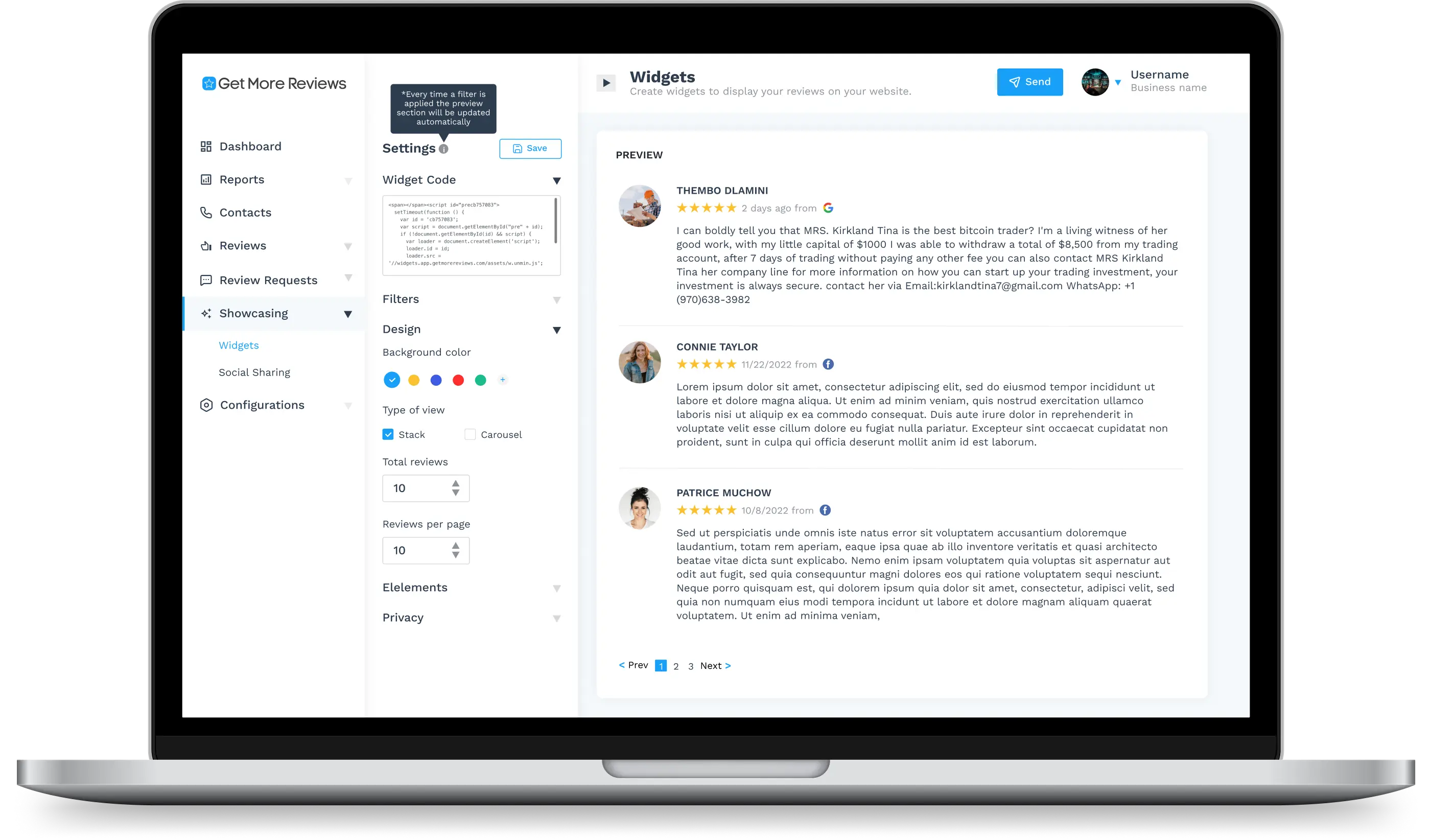
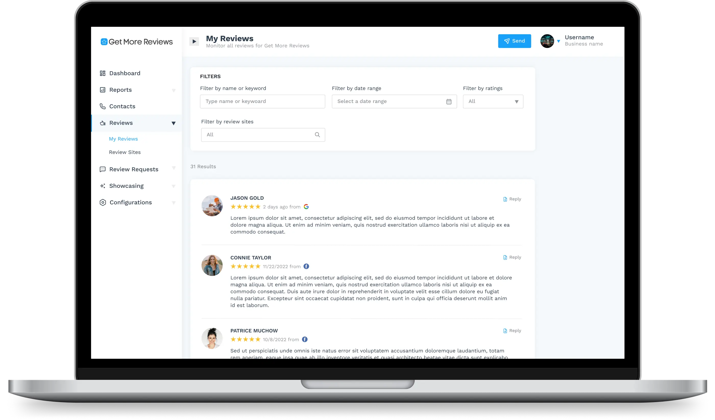
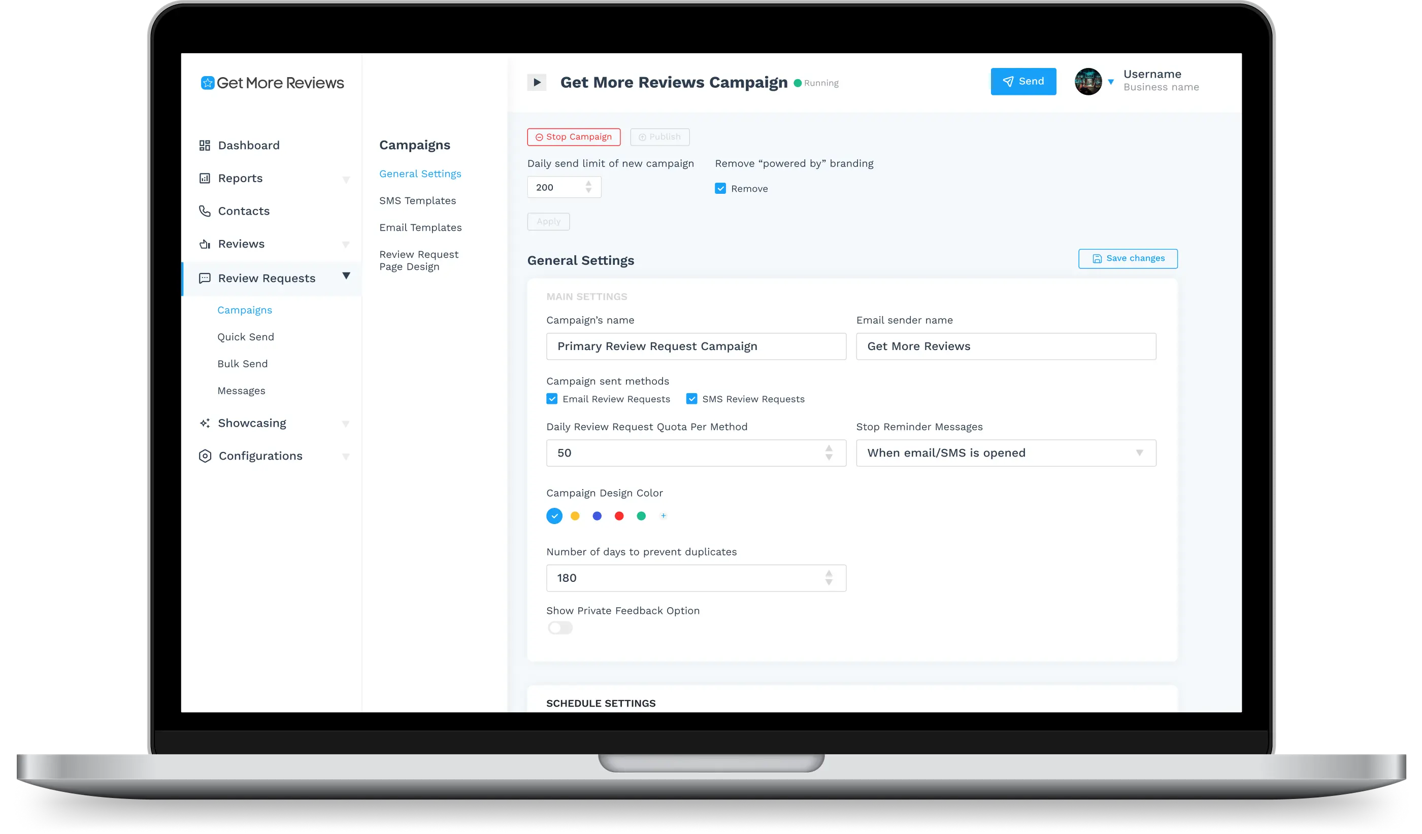
- Complete redo of side bar
- Removed the switch business functionality
- Changed the order of the menus in the side bar to be the most used on top
- Menus in the side bar with sub menus will be collapsible
- Added texts to the button icons
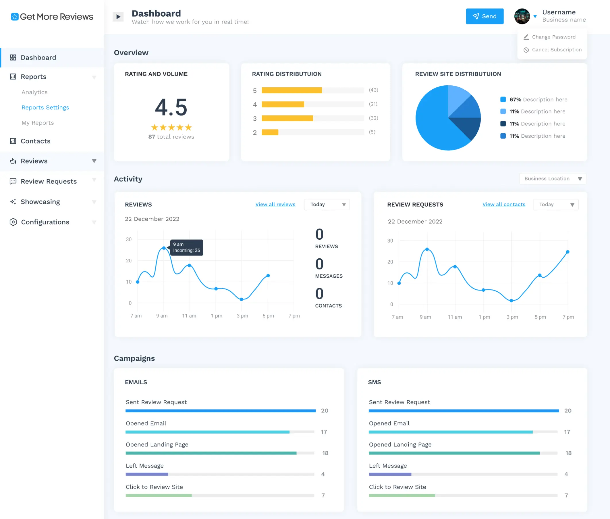
- Eliminate large blank spaces and long scrolling by fitting contents by fitting contents above the fold as much as possible
- Add brief explanation at the top of each pages
- Used a lighter shade of color from their brand guidelines for better contrast
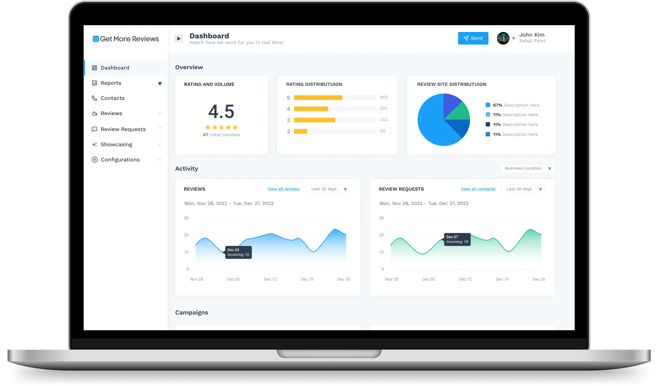
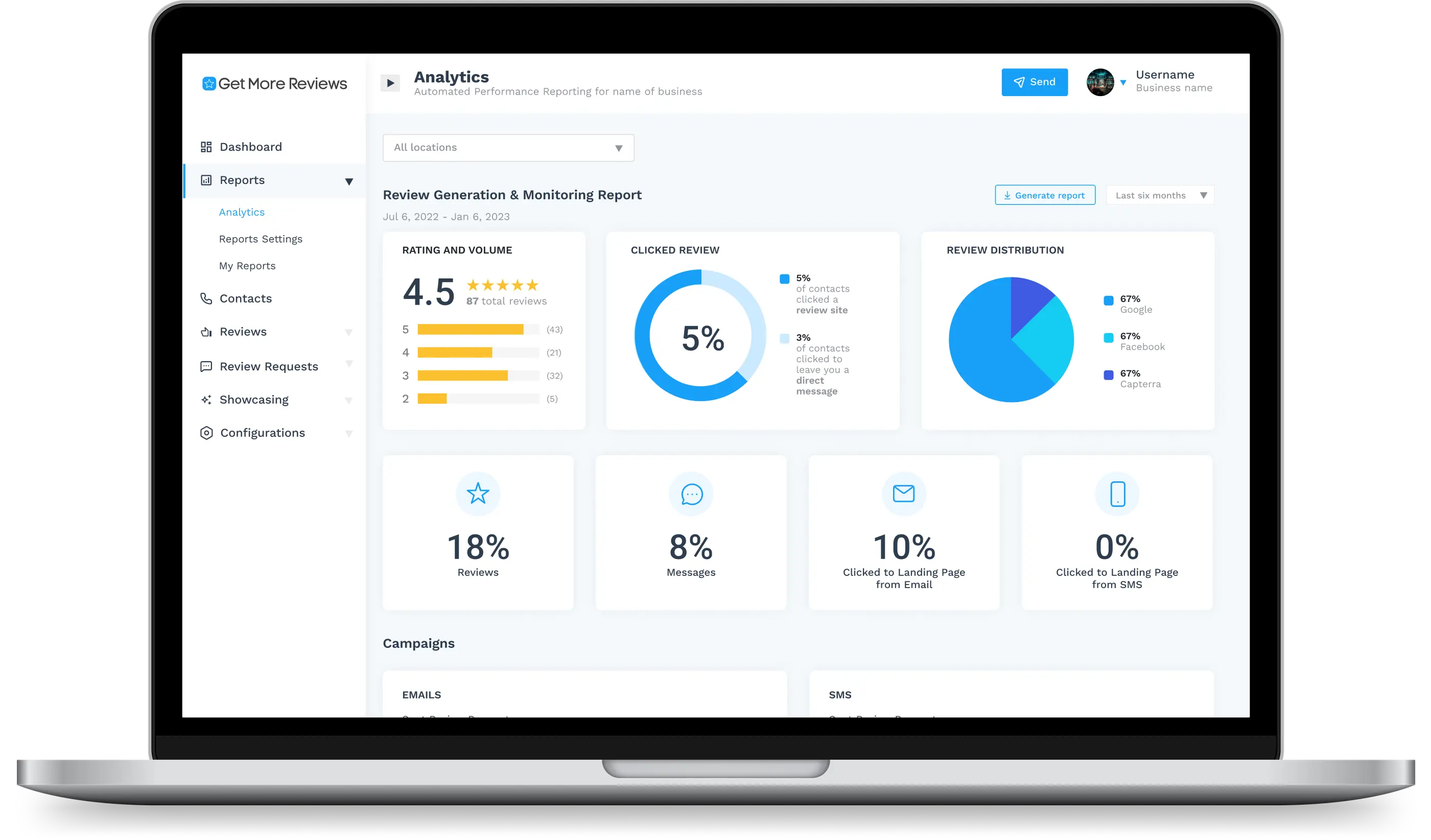
- Added simple graphs and tables to organize and summarize data
1
Content Audit
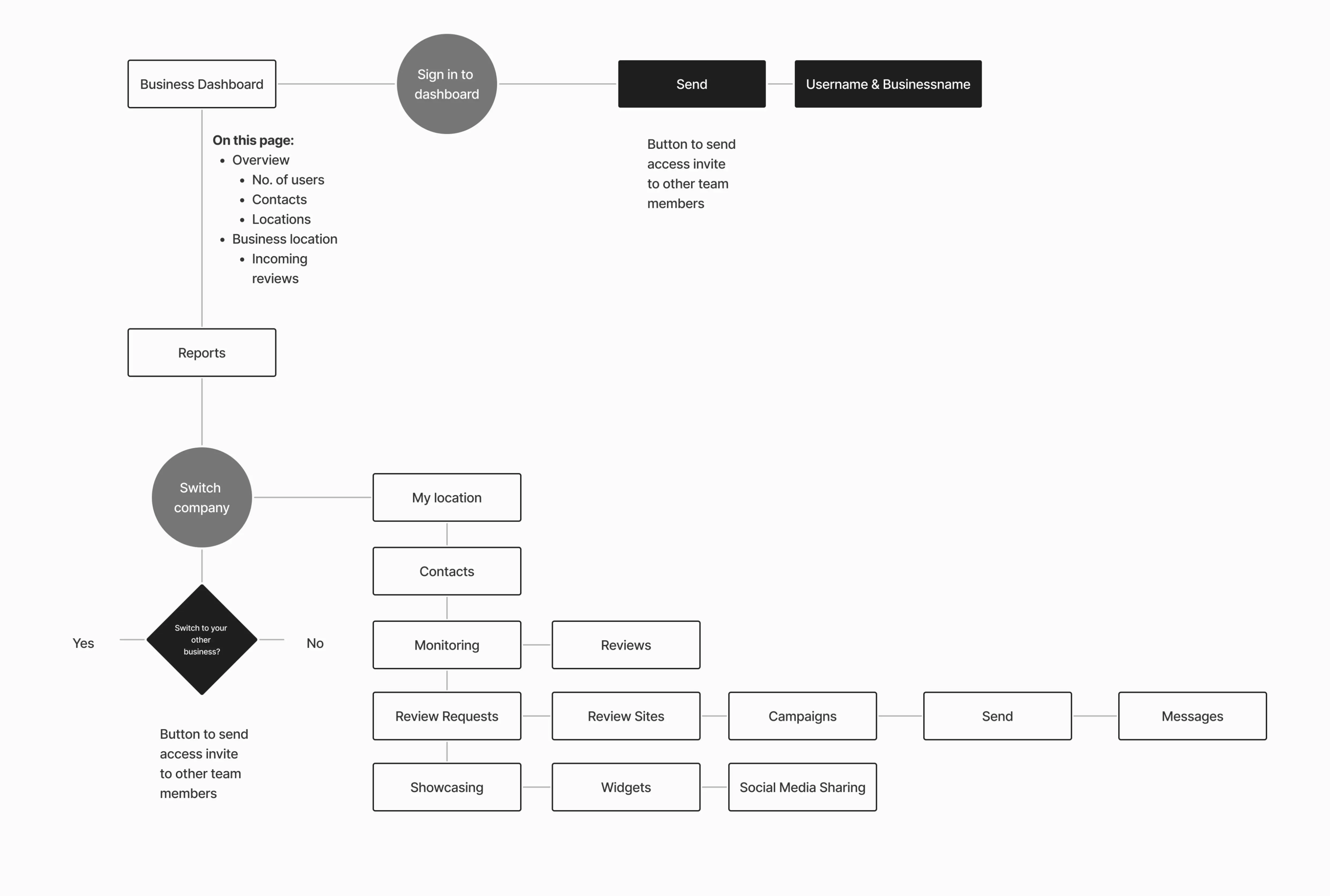
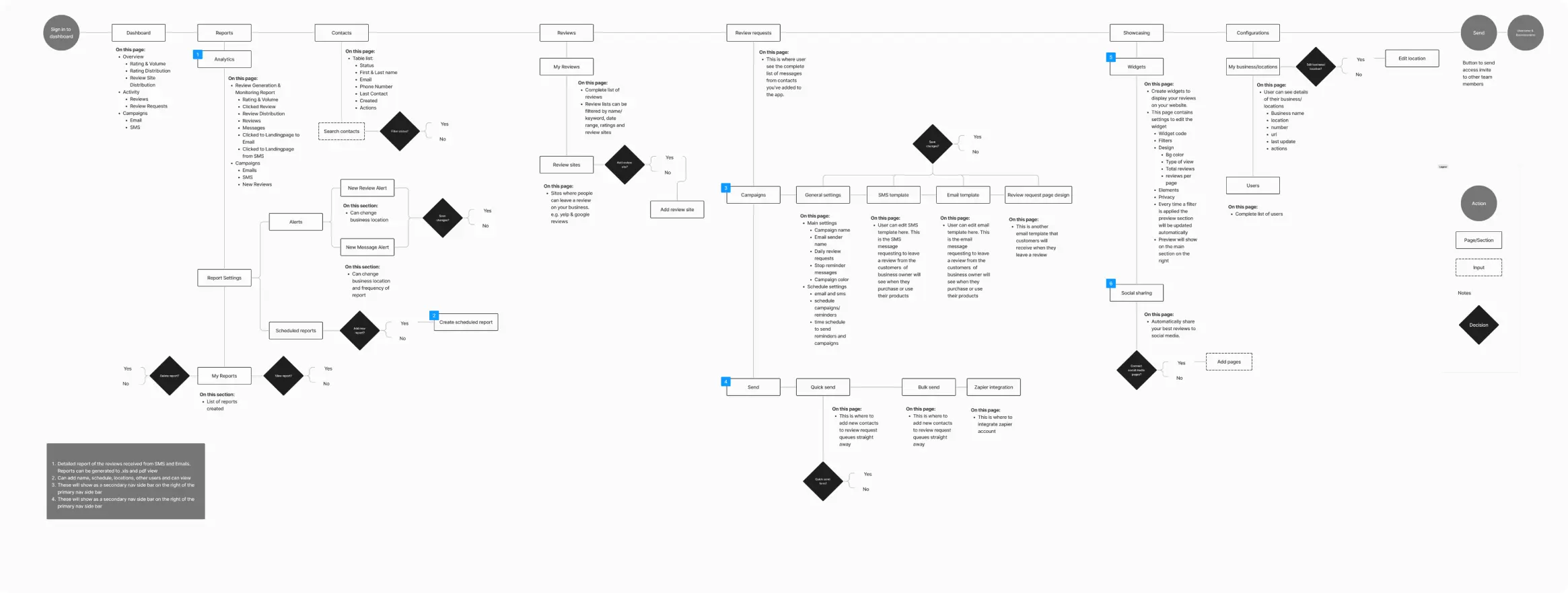
When our client approached us for an overhaul of their dashboard, they specifically mentioned wanting to simplify the side navigation bar. In the new userflow and sitemap, the order of the list has been changed, with the most visited pages now appearing at the top to make navigation easier for users. We have also eliminated the switch functionality from the sidebar to avoid confusion.
Old Sitemap
New Sitemap

2
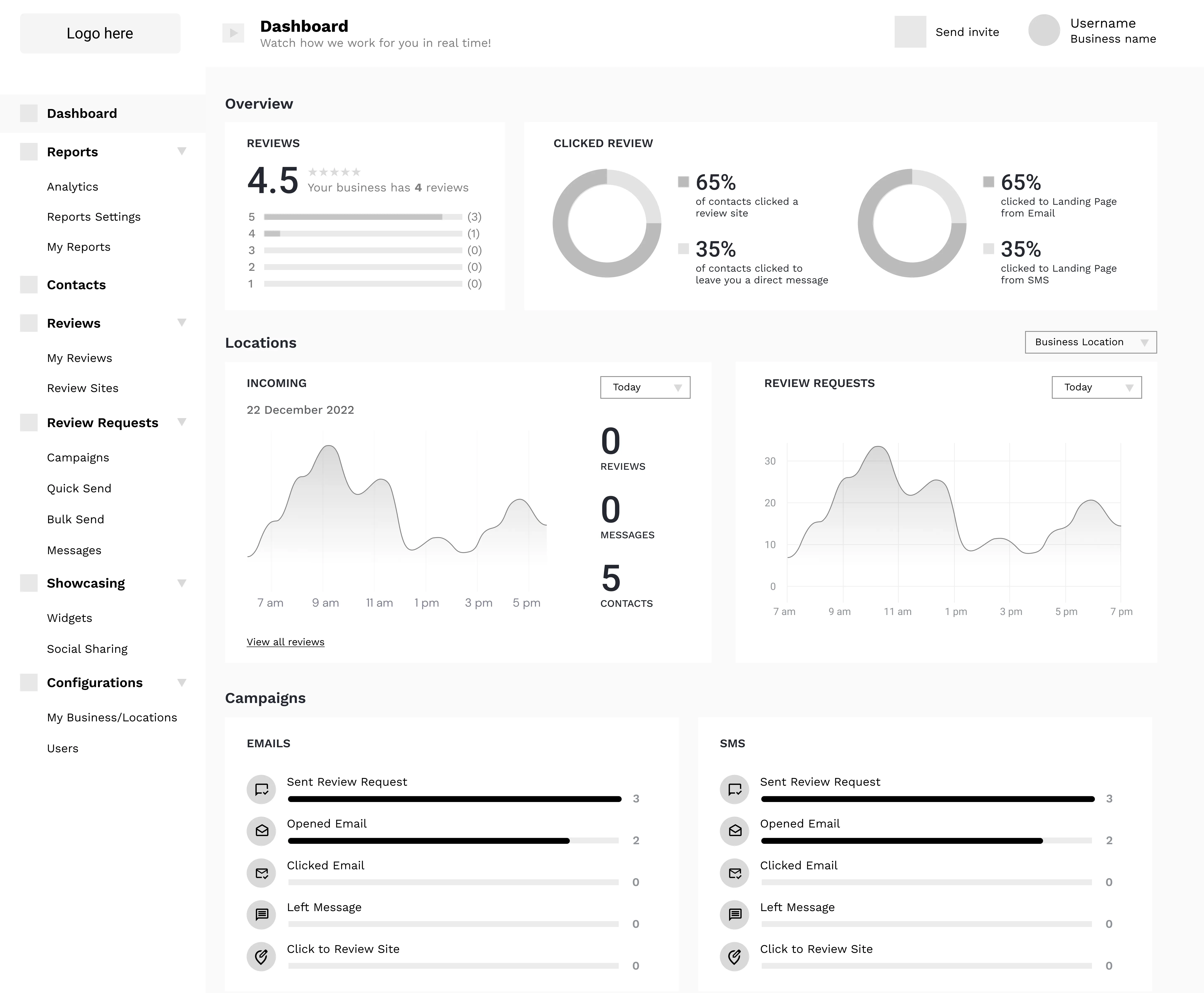
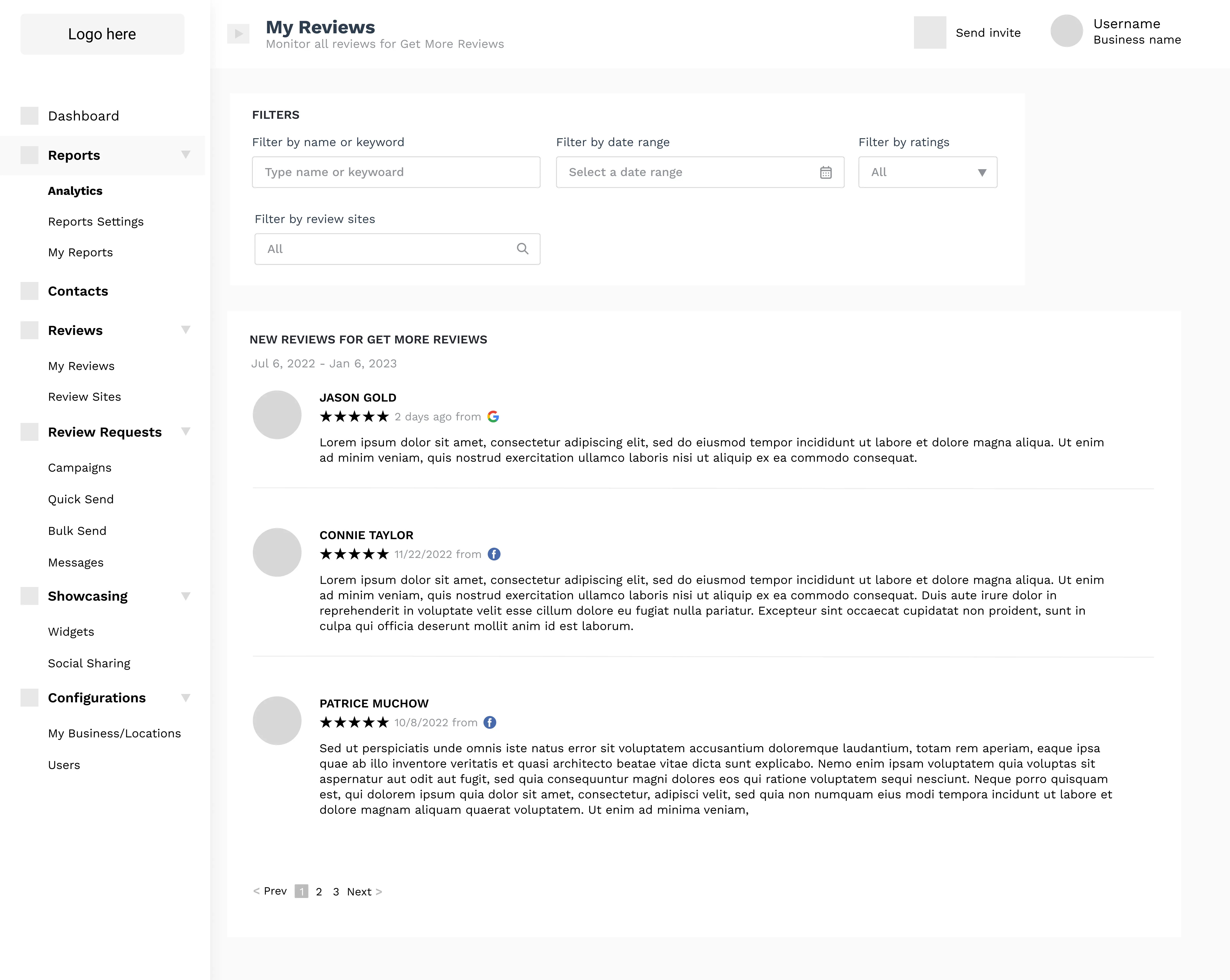
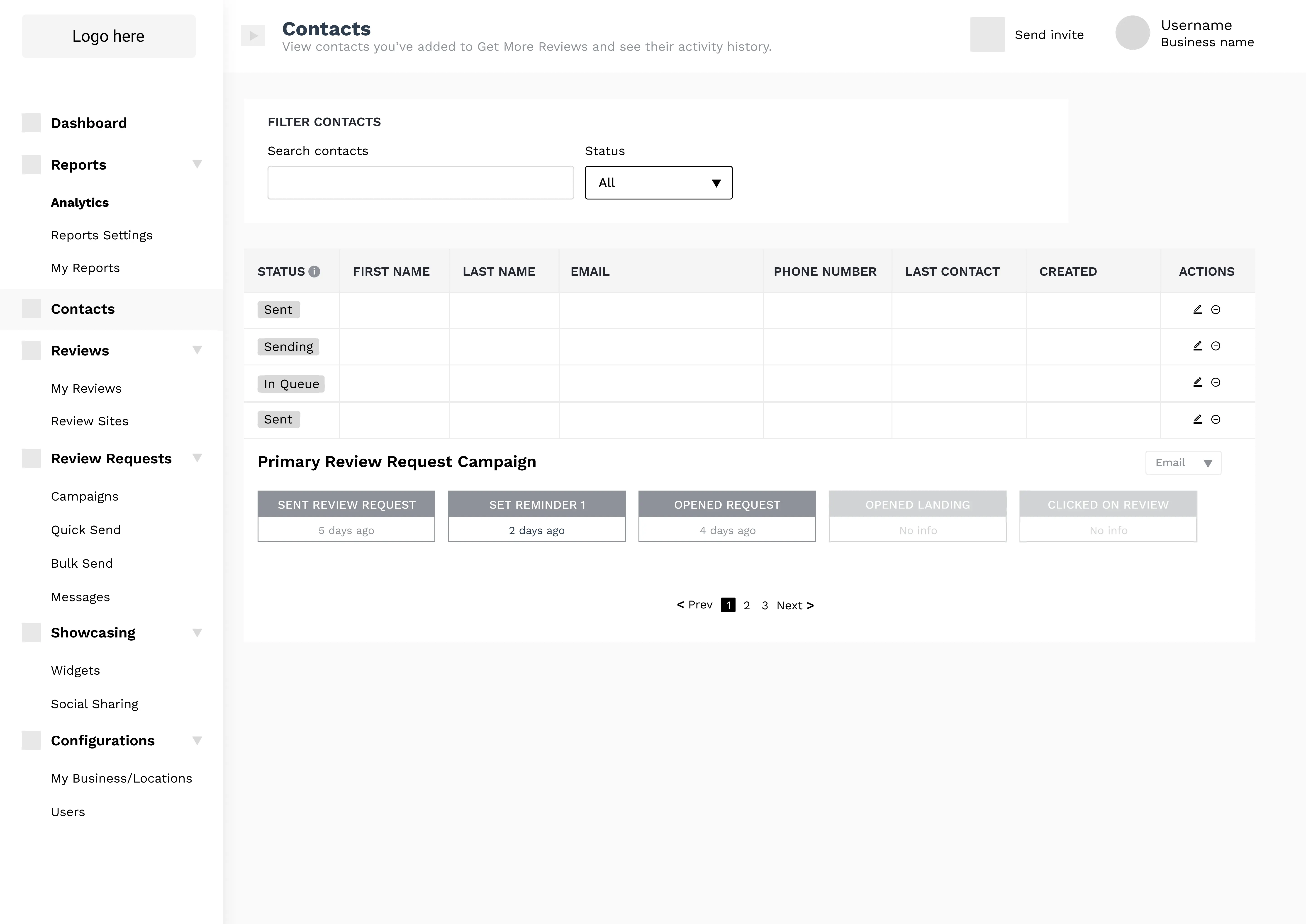
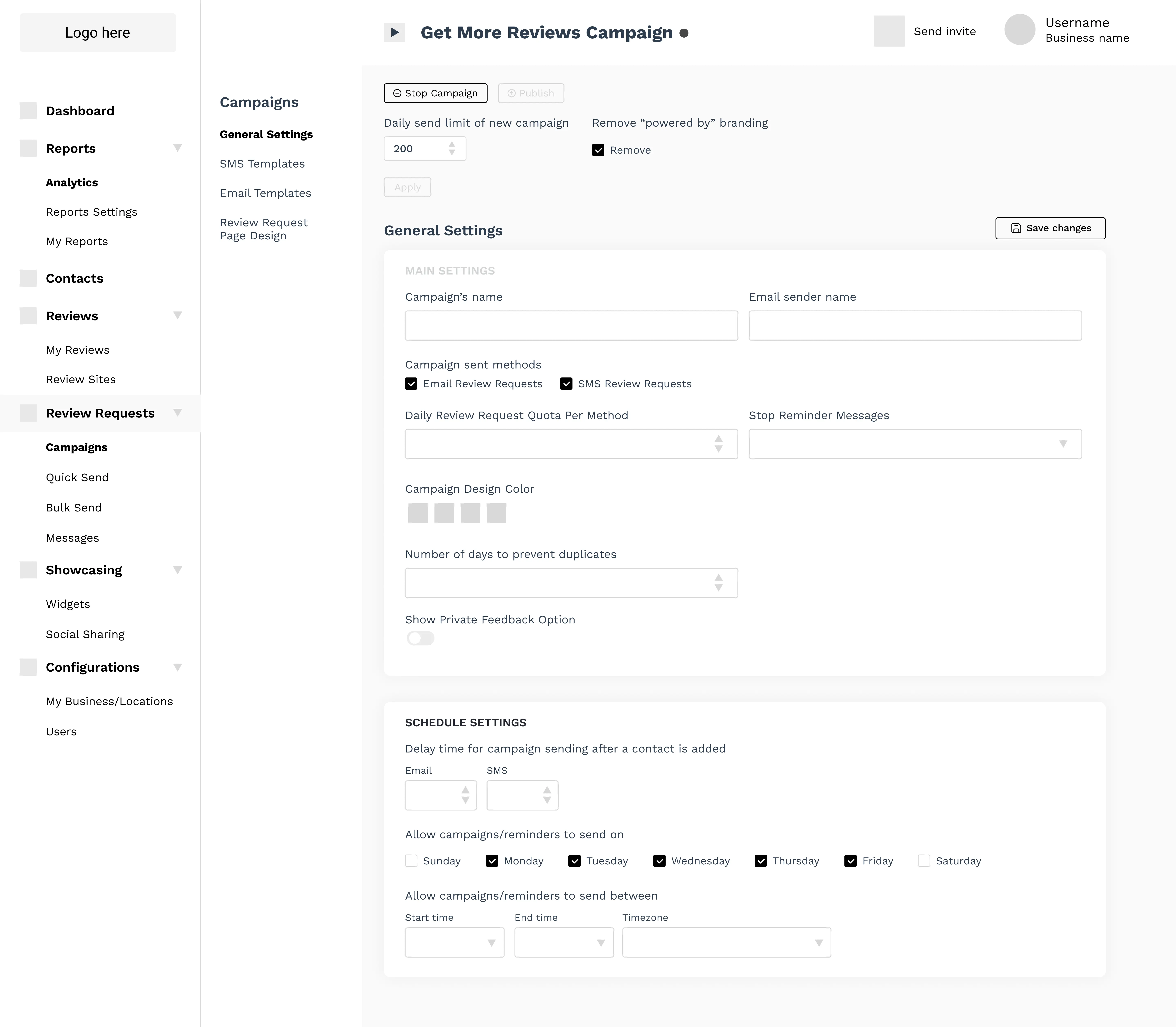
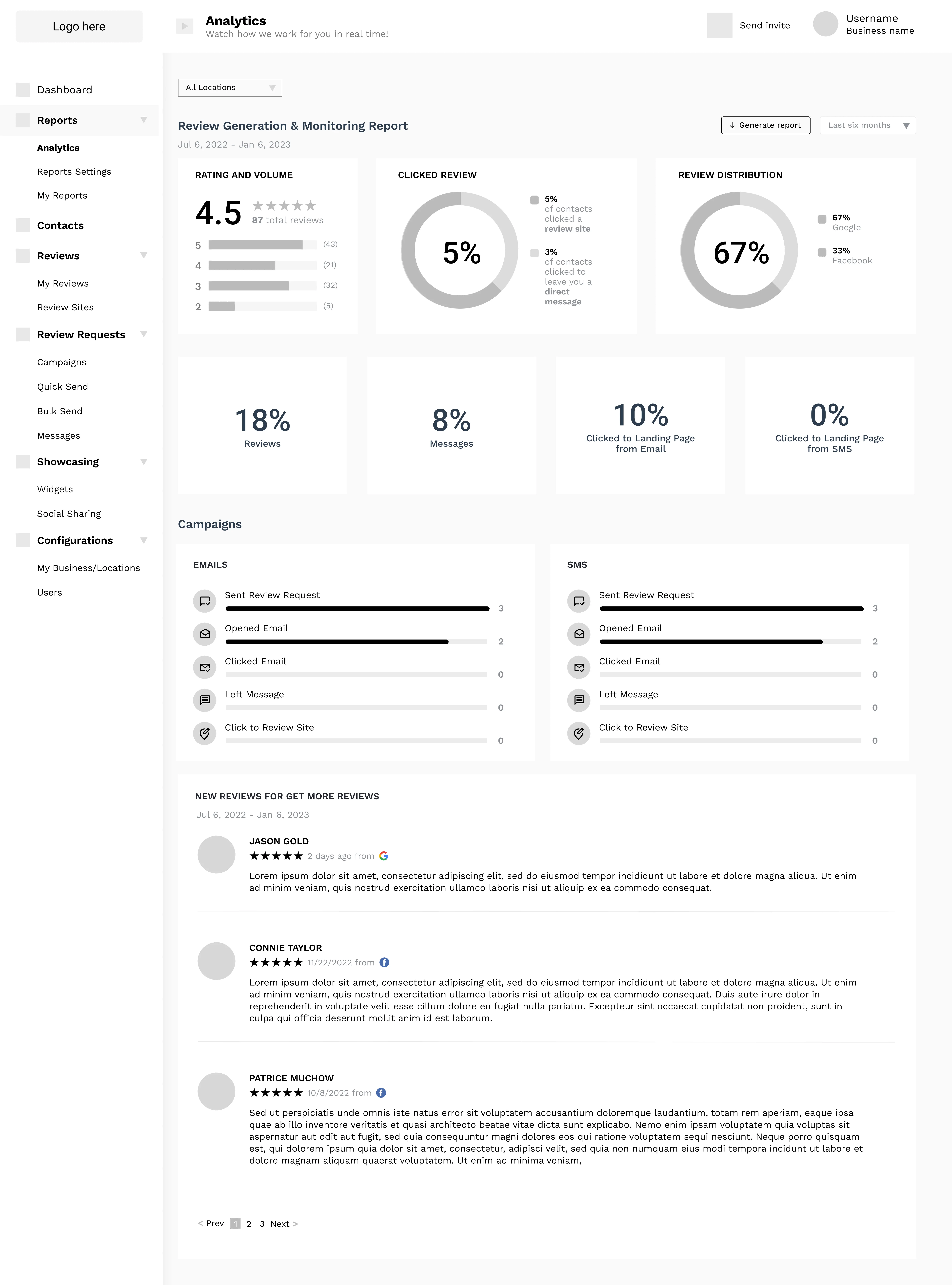
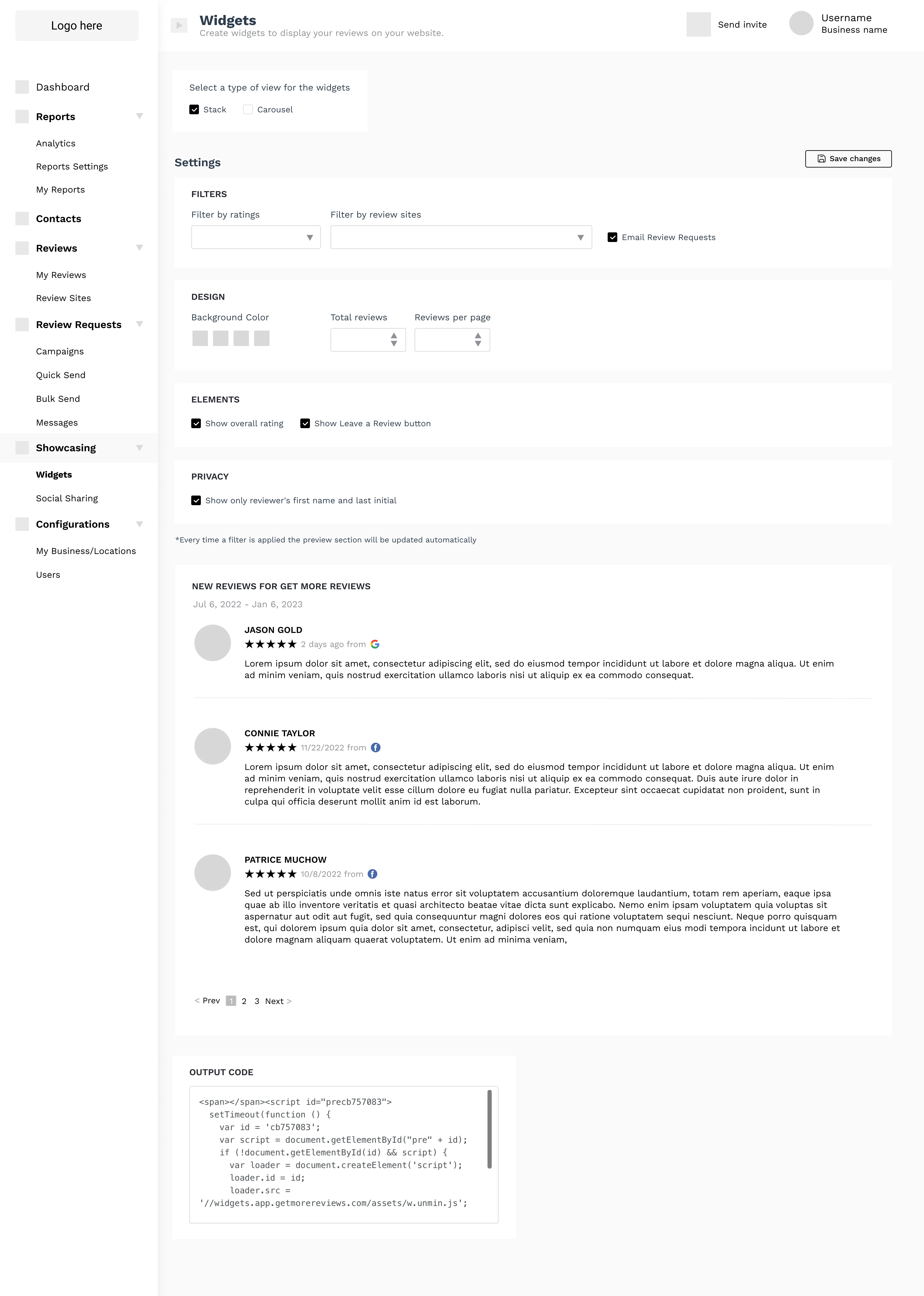
Mid-Fidelity Wireframes
3
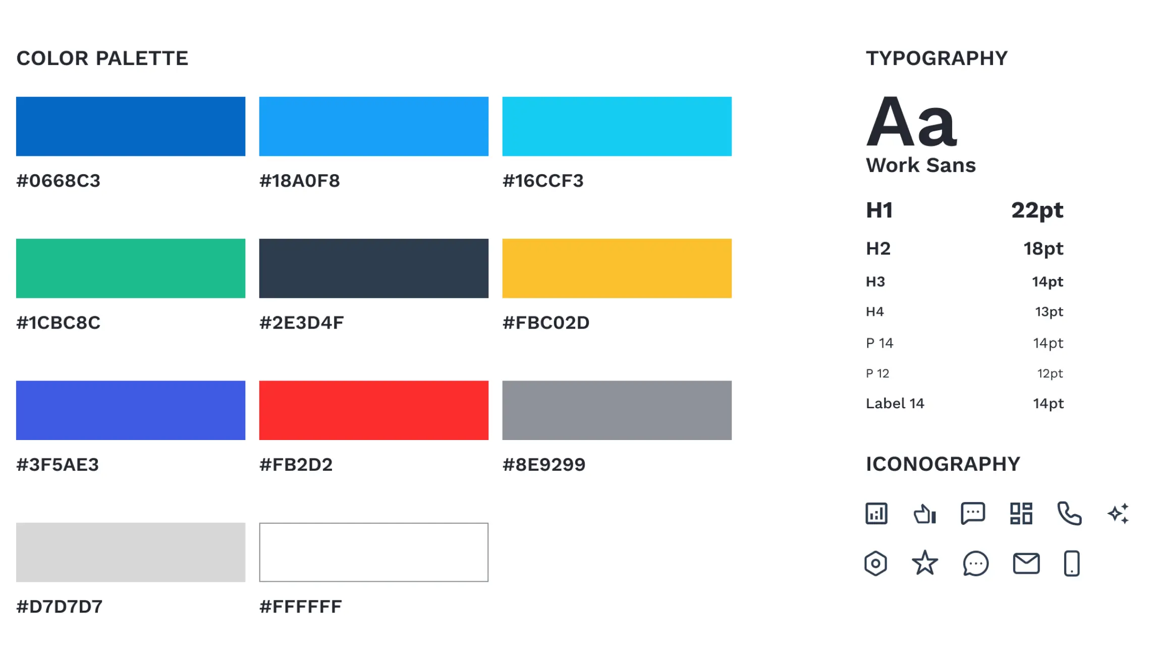
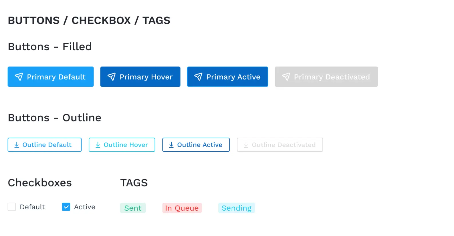
Design System
4
Design Iterations
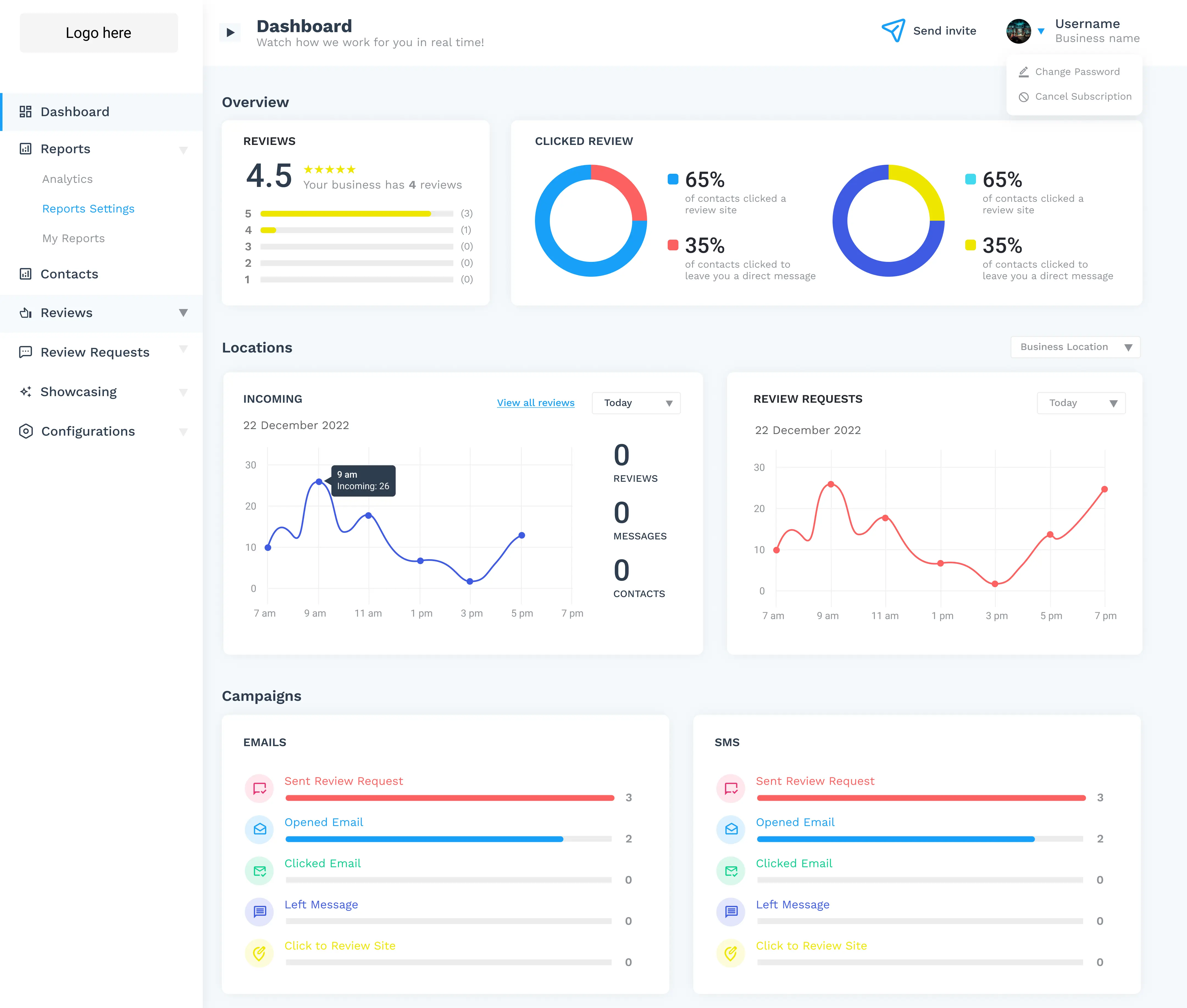
Multiple iterations were done specifically for style of graphs, paddings of the boxes in some sections and finalizing the items in the sidebar menu.
1ST ROUND
2ND ROUND
3RD ROUND
5
Final Mockups
Outcomes & Takeaway
Designing this dashboard was challenging because it involved presenting a large amount of data in a way that was clear and easy to understand. The biggest challenge was finding ways to organize complex information into graphs and tables without making the interface feel overwhelming.Designing this dashboard was challenging because it involved presenting a large amount of data in a way that felt clear and easy to understand. The biggest challenge was finding ways to compress complex information into graphs, tables, and other visualizations without making the interface feel overwhelming.
The project had a tight timeline, with more than 25 screens designed in under two months. Asking the right questions early and keeping constant communication with the team helped us stay aligned and find better solutions throughout the project.
The client was happy with the final result, and later shared that they had received positive feedback from customers, particularly about how easy the platform was to use.